The task for this project was to research the Swiss International Typographic Style and using this knowledge to produce digital brochure layouts which adhere to the Swiss design philosophy. We are tasked to produce a minimum of two brochures based on a Brighton Museum. One brochure should be image based and one brochure should be text based.
I chose Brighton Fishing Museum and produced several brochures based on this museum. The photography is all my own.

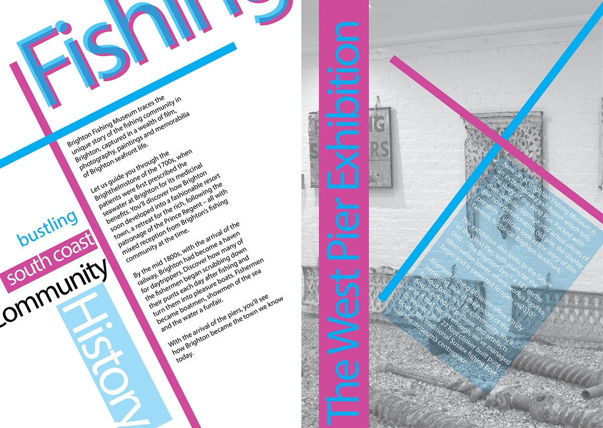
This brochure is my image based brochure, which is A5 sized. I chose A5 because it is a more handy size than the bigger A4 size and therefore better suited to a brochure that you can pick up from the Museum. In accordance with Swiss Style I chose typeface in a bright colour, which stands out. The typeface is Akzidenz-Grotesk, which is one of the original Swiss style typefaces. The type on the front cover and the inside spread is aligned at angles, with some words spreading off the page. This is also in accordance in Swiss Style. I adjusted the tracking of the typeface used for the headings on the cover and inside spread. I brought the characters closer together as this looked more in keeping with the Swiss Style. The actual body text I left alone, as to adjust the tracking would make the paragraph difficult to read. The image on the front cover, I converted to Grayscale as Swiss Style did not favour full colour images. The Swiss Style preferred black and white images. The inside spread uses some grid lines, which form part of the design and adhere to the colour scheme. The actual body text is secondary to the rest of the design. I have spaced the text out to make best use of white space. I did use a Style Sheet for this brochure,even thought there is not actually a great deal of text used, when compared to a magazine or brochure. I had seven different character styles and three different Paragraphy Styles.

The second brochure is more of a leaflet, based on a three fold layout. Three fold leaflets are very common because they allow six pages of space for print and design, whilst still folding up into a small, handy package which is easily displayed.
My leaflet uses a combination of text and images, but I wanted this leaflet to only be black and white. Swiss Style favours black and white images over full colour and so I wanted this brochure to be in black and white style. The front cover uses a background photo, which is from the museum, which I have converted to Grayscale. I added the typeface, set at an angle. The typeface is Akzidenz-Grotesk, which before Helvetica was one of the first typefaces favoured by Swiss designers. I chose to enhance my front cover design by adding three cirlces, which I coloured in different shades of black and white. Swiss Style favoured using geometric shapes.
I chose a single column layout because of the size of the brochure, which meant more than a single column layout would make the text difficult to read and appear too cluttered. I have used some headings, set against shaded text boxes to add to the dynamic design and help these sections stand out. The body text inside I spaced out to allow the text to breath and make use of white space. This is also in keeping with Swiss Style.
I used a Style Sheet for my leaflet, which comprised of three Paragraph Styles for the sub-headings and body text and four Character Styles for the Front Cover, Pull Quote and Nested Style. I used a Pull Quote and Nested Style to draw the readers attention to the paragraph and to make the paragraph more interesting and dynamic. For the main body text, for ease of reading I increased the leading to give more white space and allow the text to 'breath'. For the Sub-Headings and Main Heading I decreased the tracking to be more in keeping with Swiss Style and to give the headings more impact and design style.


This brochure is based on a text based design. I have not used any images or photos in this brochure, as per the brief. I wanted to use a combination of simple, dynamic text on the front cover, which I set at an angle. I added two vector shapes of a fish and a fishing net, which set the tone of the brochure and also complement the Swiss Style layout.
I wanted the inside spread to adhere to the grid layout favoured by Swiss Style designers. I chose a more literal interpretation of this by keeping my fishing net design inside and using this as part of the grid layout. The inside spread also makes best use of white space, which draws the eye to the written text. I hope that my 'fishing net' text box design style also draws the eye and makes the text more appealing.
I used a Style Sheet for the layout, which has approximately nine Paragraph Styles and two Character Styles. I have altered the leading and tracking of certain parts of the text, which either allow for better reading, or add to the design element.


My final brochure is a presentation of my study of Swiss Style design. Initially this was laid out as a three fold brochure, but the amount of text meant that it was difficult to adhere to a Swiss Style layout of using more white space, as the shear amount of text became too cluttered. I decided it would look better presented as a Four Fold leaflet, which gives me eight pages of space. This allows me to keep an element of white space and break up the text with images and design elements.
This Four-Fold brochure layout is sometimes also called a Gate style and the front cover is located one page in from the edge. The mockup gives an idea how it is folded to create a small leaflet, which is most common for contemporary leaflet styles. The beauty of this fold is that it gives a much larger amount of page space than a Tri-Fold leaflet, but still folds down to the same size.
I used Akzidenz Grotesk typeface in the leaflet, as this was a popular Swiss typeface, pre-Helvetica. I have kept to the grid throughout the leaflet, with the exception of the Sub-Heeading. I did this to create uniformity, as was common to Swiss Style.
For the main body text, I have increased the leading to allow for easier reading and to conform more to Swiss Style. For the sub-headings and front cover I decreased the tracking in the text to give more impact and confirm to Swiss Style. I have also used some geometric shapes to enhance my design. Geometric shapes were popular with Swiss Style Design.
I used a Style Sheet for this leaflet, comprising of approximately three Paragraphy Styles and two Character Styles.


